

Progressive Web App vs Native App: Which One Does Your Business Need?
October 19, 2026
AI in Education: A Practical Guide for Indian Schools and Coaching Institutes
October 21, 2026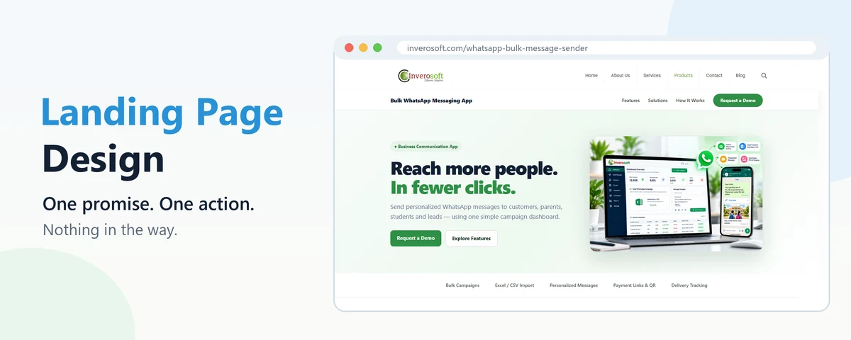
A homepage has to introduce the whole business. A landing page has one job: get the visitor who just clicked an ad, a search result or a WhatsApp link to take a single next step. That narrower job is why landing page design follows different rules from the rest of a website, and why a page that looks beautiful can still bring in almost no enquiries. This guide walks through the parts of a landing page that actually decide whether people act, using one of our own pages as a worked example.
Landing Page vs Homepage: Why the Rules Differ
Someone arriving on your homepage might want anything: your address, your services, a job. Someone arriving on a landing page came for one specific thing, usually promised by the ad or link they clicked. If the page talks about everything else first, they leave. Good landing page design therefore removes choices instead of adding them. There is one offer, one main button, and usually no full navigation menu pulling people elsewhere.
This also explains a common disappointment. A business runs Google Ads to its homepage, gets clicks, and very few calls. The ad was fine; the destination was not built for the person who clicked it.
The Seven Parts of Effective Landing Page Design
- A headline that repeats the promise. If the ad said “Fee reminders to every parent on WhatsApp”, the headline should say nearly the same thing. A visitor should know within three seconds that they are in the right place.
- One sentence of explanation. Who it is for and what it does, in plain words. Save the detail for further down.
- A clear main button. Specific wording beats generic: “Request a Demo” or “Get a Quote in 24 Hours” says more than “Submit”.
- Proof the thing exists. A real screenshot, a product photo, or a short video. Stock photos of smiling people in offices prove nothing.
- Benefits in scannable blocks. Short headings with one or two lines each, because most visitors scroll and skim before they read.
- Answers to the doubts that stop people. Price range, how long it takes, what happens after they enquire. Leaving these out does not make people curious; it makes them hesitate.
- The same button again near the end. Someone who has read everything should not have to scroll back to the top to act.
A Worked Example: Our Own Product Page
When we built the page for our WhatsApp bulk message sender, we followed this structure deliberately. The first screen has a short headline, one line saying who it is for, a “Request a Demo” button and a real screenshot of the dashboard. Below that sits a strip of five features, then twelve short feature cards, a four-step “how it works” section, examples for six types of business, and a final band with the same demo button.
Two decisions are worth explaining. The demo button opens a small form in a popup instead of sending people to a separate contact page, because every extra page loses some visitors. And the form asks for only what we need to call back: name, number, business name, business type and an optional message. Each field you add is one more reason to give up.
Design for the Phone First
For most Indian businesses, the majority of landing page visitors arrive on a phone, often from Instagram, Facebook or WhatsApp. In landing page design, start with the phone version and treat the desktop as the variation, not the other way round. In practice that means a headline that fits in two lines on a small screen, a button large enough to tap with a thumb, a form that brings up the number keypad for phone fields, and nothing that needs a mouse to hover over. Our guide to responsive web design covers the wider principles.
Speed Is Part of Landing Page Design
A slow landing page loses people before they see anything, and it also costs money if you advertise. Google says that landing page experience, which includes how quickly and easily a page works on mobile, affects how your ads perform; its help page on landing page experience lists what it looks at.
The usual culprits are easy to spot: hero images several megabytes in size, sliders nobody waits for, a chat widget, three tracking scripts and a font loaded in six weights. Compressing images to WebP, dropping the slider and loading only what the page actually uses often does more than any visual redesign.
Common Landing Page Design Mistakes
- Sending ad traffic to a general page. The visitor has to hunt for the thing the ad promised.
- Too many choices. Three different buttons, a full menu and links to the blog all compete with the one action you want.
- Long forms. Asking for address, budget and company size before you have even spoken puts people off. Ask later, on the call.
- Vague headlines. “Innovative solutions for your growth” could be about anything, so it persuades nobody.
- No way to know it worked. Without conversion tracking you cannot tell which version of the page or which ad brings enquiries.
An honest caveat: no layout guarantees results. A clear page will not rescue an offer people do not want, or ads aimed at the wrong audience. What good design does is make sure that when the offer and audience are right, the page is not the thing getting in the way.
Where Inverosoft fits in
We plan, design and build websites and landing pages that are made to bring in enquiries, not just to look good, including the tracking that tells you which ad or page is working. If your current site needs more than a single new page, our website redesign guide explains when a rebuild makes sense, and our checklist for picking a web design company lists the questions to ask any agency, including us. To discuss a landing page for your next campaign, get in touch.
Frequently Asked Questions
How long should a landing page be?
As long as it takes to answer the visitor’s doubts, and no longer. A simple offer such as a free consultation can work on one screen, while a product people pay for usually needs features, proof and answers further down.
Should a landing page have a navigation menu?
Usually not a full one. Links to other pages give visitors a way to wander off. A logo and, at most, a few links that jump to sections on the same page are enough.
Do I need a separate landing page for every ad?
Not for every ad, but for every distinct offer or audience. A school and a clinic searching for the same product care about different things, so separate pages often perform better.
What do landing page design services usually include?
Typically the page structure and copy, the visual design, mobile and speed optimisation, the form, and conversion tracking. Ask whether writing the words is included, because the copy matters as much as the design.
Good landing page design is mostly about subtraction: one promise, one action, nothing in the way. If your ads are getting clicks but not calls, the page is the first place to look, and we are happy to take a look with you.


